基本目录结构
Pages是小程序的基本单位,事实上一切都是组件。
一个页面下有四个文件: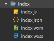 基本同Web开发。
只要文件同名,不需要引用其他文件就能直接调用。例如wxml文件中不需要引入wxss就能直接调用
全局配置(不能更名):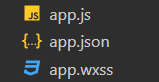 其中小程序运行的最低要求是app.json和页面。
json文件里不能写注释。
需要先在app.json中加入
{
    "pages": [

    ]
}
之后才可以新建页面,且默认显示第一个注册项的页面。
也可以用 "entryPagePath" 设置首页
基础页面开发流程思路
先写骨架标签(组件)
例如我们在一页里需要一张图片,一段文字,一个按钮,我们先把骨架标签写上:
<image></image>
<text></text>
<button></button>
在骨架标签里填充内容
<image src="/images/1.png"></image>
<text>Hello,云升</text>
<button>开启小程序之旅</button>
补充:
绝对路径以 / 开头
相对路径以 . 开头,每一个点返回上一级
修改样式
在wxss文件里写,不用驼峰命名用 - 连字。
初步:
.user-avater {
  width: 240rpx;
  height: 240rpx;
  /* 距离顶部的长度 */
  margin-top: 170rpx;
}
<image class="user-avater" src="/images/avater/1.png"></image>
<text>Hello,云升</text>
<button>开启小程序之旅</button>
rpx 是小程序专门定制的一个可以自动响应当前机型屏幕分辨率和大小的自适应像素单位。iphone6机型下 1px = 2rpx
flex布局初识
使用<view> :
<view>
  <image class="user-avater" src="/images/avater/1.png"></image>
  <text>Hello,云升</text>
  <button>开启小程序之旅</button>
</view>
<view> 的作用是做布局,通常称其为容器。
flex 容器布局
.container {
  /* 使用flex布局 */
  display: flex;
  /* 设置flex方向 */
  flex-direction: column;
  /* 设置flex水平居中 */
  align-items: center;
}
.motto {
  color: #666;
  margin-top: 100rpx;
  font-size: 32rpx;
  font-weight: bold;
}
<view class="container">
  <image class="user-avater" src="/images/avater/1.png"></image>
  <text class="motto">Hello,云升</text>
  <view class="journey-container">
    <text>开启小程序之旅</text>
  </view>
</view>
补充:
image组件默认宽度320px、高度240px。
button 组件一般不推荐使用,可用 view 模拟或使用组件库组件 。
居中方案优先考虑flex居中:
display: flex;
align-items: center;
自定义一个Button组件——基于view
.journey-container {
  border: 1px solid #405f80;
  width: 200rpx;
  height: 80rpx;
  /* 设置圆角 */
  border-radius: 10rpx;
  /* text-align不能放到text标签中 */
  text-align: center;
  margin-top: 200rpx;
}

.journey {
  font-size: 22rpx;
  color: #405f80;
  line-height: 80rpx;
}
<view class="container">
  <image class="user-avater" src="/images/avater/1.png"></image>
  <text class="motto">Hello,云升</text>
  <view class="journey-container">
    <text class="journey">开启小程序之旅</text>
  </view>
</view>
顶部导航栏如何调整
在app.json中修改:
{
  "pages": [
    "pages/welcome/welcome"
  ],
  "window": {
    "navigationBarBackgroundColor": "#b3d3db"
  },
  "sitemapLocation": "sitemap.json"
}
注意每一项之后加 , 隔开。
关于全局配置,可参考官方文档。
如何对整个页面进行调整
在页面wxss文件下:
page {
  background-color: #b3d3db;
}
最终首页预览

添加新页面
添加posts页面,在开发工具编译模式里选择添加编译模式,把启动页面设置为新页面:
将顶部导航栏改为红色,打开posts.json:
{
  "usingComponents": {},
  "navigationBarBackgroundColor": "#c22a1e"
}
swiper组件
滑块视图容器,和 swiper-item 搭配使用实现轮播效果。
<view>
   <swiper indicator-dots="{{true}}" autoplay="{{true}}">
      <swiper-item>
         <!-- 插槽 -->
         <image src="/images/banner/banner1.jpg"></image>
      </swiper-item>
      <swiper-item>
         <image src="/images/banner/banner2.jpg"></image>
      </swiper-item>
      <swiper-item>
         <image src="/images/banner/banner3.jpg"></image>
      </swiper-item>
   </swiper>
</view>
swiper {
   width: 100%;
   height: 460rpx;
}

swiper image {
   width: 100%;
   height: 460rpx;
}
思考哪些组件定义了css
indicator-dots="true" 指示点。
autoplay="true" 自动轮播。
补充:这里我们测试发现把 indicator-dots="true" 中的值改为false依然会显示指示点,原因是不加 {{}} 的情况下false会被认为是一个普通的字符串,而不是布尔值,一个普通的字符串会被认为是true,正确的设置方法:indicator-dots="{{false}}" ,或者不设置值,因为其默认值为false,而当只有属性没有属性值时为true,例如 indicator-dots 为true。
需要其他属性时优先查官方文档。
实现第一篇文章
flex组织布局思路
从整体到局部:
- 考虑方向,水平/垂直布局;
- 考虑有多少行/列,按行/列构建组件,如果一行/列只有一个元素通常
<view>可以省略; - 把静态内容填充上;
- 排样式,根据
<view>从大到小一层层处理。
<view class="post-container">
   <view class="post-author-date">
      <image class="post-author" src="/images/avater/2.png"></image>
      <text class="post-date">Nov 14 2022</text>
   </view>
   <text class="post-title">2020LPL夏季赛季后赛观赛指南</text>
   <image class="post-image" src="/images/banner/banner1.jpg"></image>
   <text class="post-content">2020LPL夏季赛季后赛观赛指南2020LPL夏季赛季后赛观赛指南2020LPL夏季赛季后赛观赛指南2020LPL夏季赛季后赛观赛指南2020LPL夏季赛季后赛观赛指南</text>
   <view class="post-like">
      <image class="post-like-image" src="/images/icon/chat.png"></image>
      <text class="post-like-font">92</text>
      <image class="post-like-image" src="/images/icon/view.png"></image>
      <text class="post-like-font">102</text>
   </view>
</view>
/* pages/posts/posts.wxss */
swiper {
   width: 100%;
   height: 460rpx;
}

swiper image {
   width: 100%;
   height: 460rpx;
}

.post-container {
   /* 设置为一个flex容器 */
   display: flex;
   /* 设置为垂直方向 */
   flex-direction: column;
   /* 设置上边距 */
   margin-top: 20rpx;
   /* 设置下边距 */
   margin-bottom: 40rpx;
   /* 设置背景色 */
   background-color: #ffffff;
   /* 设置上边线和下边线 */
   border-top: 1px solid #ededed;
   border-bottom: 1px solid #ededed;
   /* 设置内边距 */
   padding-bottom: 10rpx;
}

.post-author-date {
   /* margin-top: 10rpx;
   margin-bottom: 20rpx;
   margin-left: 10rpx; */
   /* margin顺序:上右下左 */
   margin: 10rpx 0 20rpx 10rpx;
   /* 用flex设置居中 */
   display: flex;
   flex-direction: row;
   align-items: center;
}

.post-author {
   width: 60rpx;
   height: 60rpx;
   /* 设置居中 */
   /* vertical-align: middle; */
}

.post-date {
   margin-left: 18rpx;
   font-size: 26rpx;
   /* vertical-align: middle; */
}

.post-title {
   font-size: 34rpx;
   font-weight: 600;
   margin-bottom: 20rpx;
   margin-left: 16rpx;
   color: #333;
}

.post-image {
   width: 100%;
   height: 340rpx;
   margin-bottom: 30rpx;
}

.post-content {
   color: rgb(58, 58, 58);
   font-size: 28rpx;
   margin-bottom: 20rpx;
   margin-left: 16rpx;
   margin-right: 16rpx;
   /* 设置文字行距 */
   line-height: 40rpx;
   /* 设置字间距 */
   letter-spacing: 3rpx;
}

.post-like {
   display: flex;
   flex-direction: row;
   margin-left: 16rpx;
   align-items: center;
}

.post-like-image {
   height: 26rpx;
   width: 26rpx;
   margin-right: 12rpx;
}

.post-like-font {
   margin-right: 32rpx;
   font-size: 24rpx;
}
静态效果:
Lin UI组件库
组件库的安装
进入项目根目录:
$ npm init
初始化完成后:
$ npm i lin-ui
在微信开发者工具中选择: 构建npm。
如何使用自定义组件
在页面json文件中:
{
  "usingComponents": {
    "l-avater":"/miniprogram_npm/lin-ui/avatar/index"
  }
}
指向目录下文件名
头像 Avatar | Lin UI (talelin.com)
试用icon组件
{
  "usingComponents": {
     "l-icon":"/miniprogram_npm/lin-ui/icon/index"
  }
}
   <view class="post-like">
      <!-- <image class="post-like-image" src="/images/icon/chat.png"></image> -->
      <l-icon class="post-like-image" color="#666" size="26" name="favor" />
      <text class="post-like-font">92</text>
      <!-- <image class="post-like-image" src="/images/icon/view.png"></image> -->
      <l-icon class="post-like-image" color="#666" size="32" name="eye" />
      <text class="post-like-font">102</text>
   </view>